Role:
• Built product from scratch
• User Research
• Wireframes/Information Architecture
• Prototyping
• Usability Testing
• Built and maintained a design system
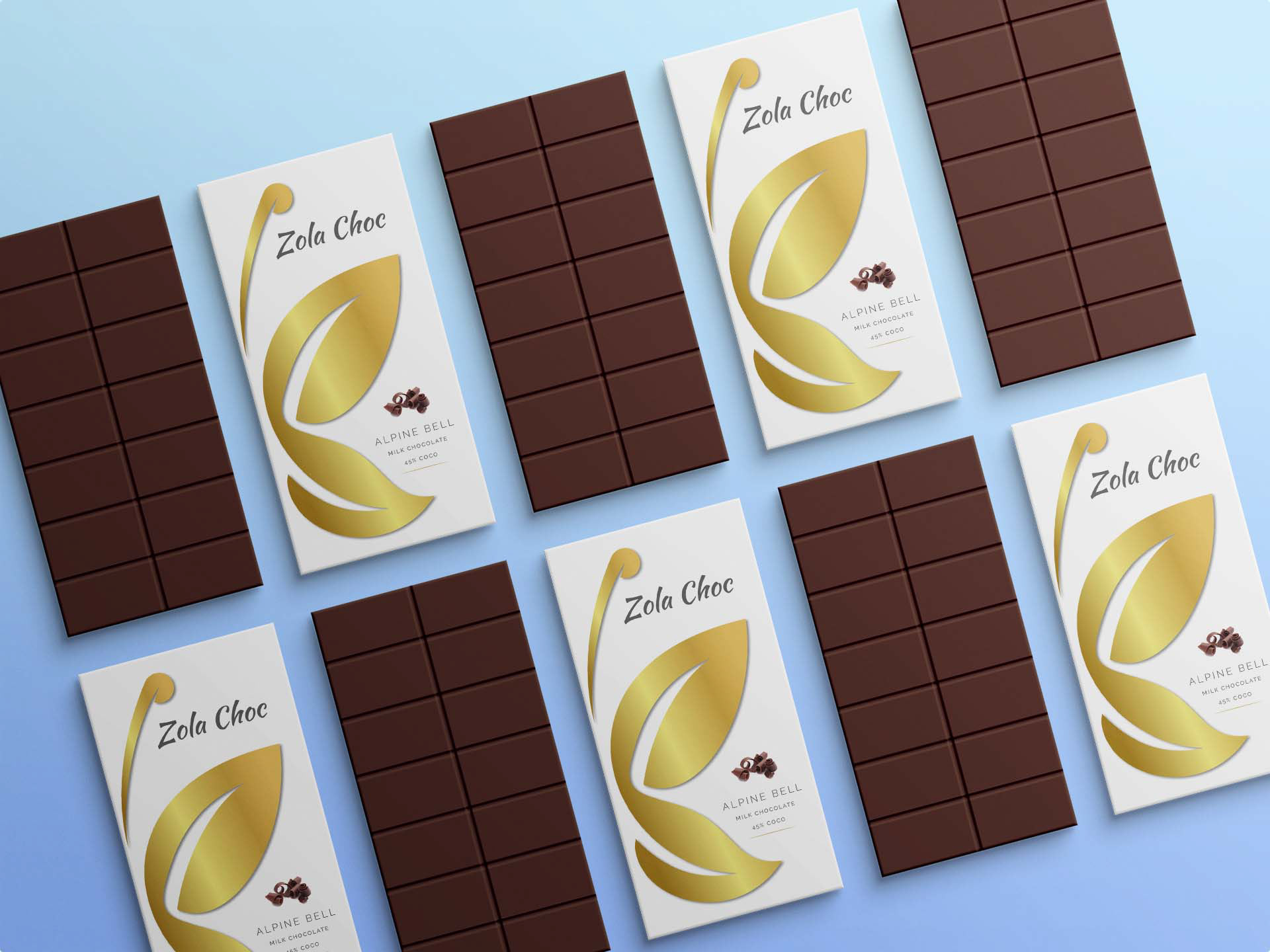
• Branding
Outcome:
• Fully validated design
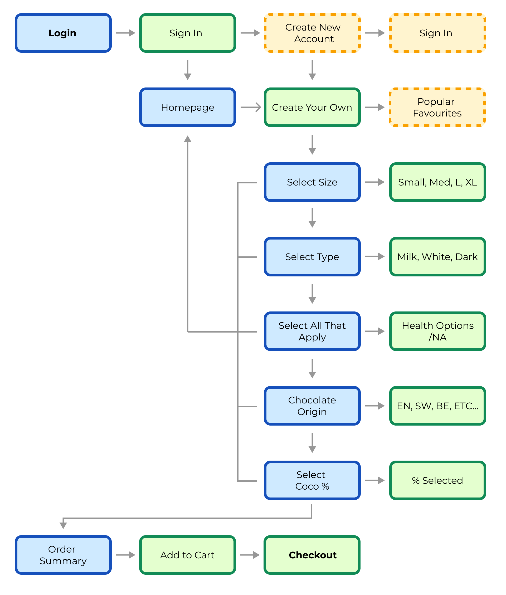
• Login to order completion in just 12 clicks
• Udacity Nanodegree Certification
Whatever happened to the good ol’ chocolate bar? The bedrock for any delicious chocolate experience. What if there was an app where people could order high quality plain chocolate bars specific to their tastes?
As part of my Udacity Nanodegree my goal for this project was to create the best possible app that fulfils the exact needs of users for what is required for a simple chocolate bar ordering app.
The Process
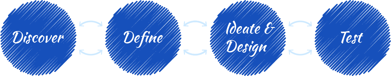
At the beginning of the iterative process for this project, it was essential for me to understand what users would potentially want out of a simple chocolate bar ordering app.
I interviewed 4 participants to gauge there various needs and pain points and how they might use an app for ordering simple chocolate bars.
For the interviews I gathered 4 participants from Udacity’s peer support network.
I interviewed 4 participants to gauge there various needs and pain points and how they might use an app for ordering simple chocolate bars.
For the interviews I gathered 4 participants from Udacity’s peer support network.

Alexei: Age 38, from the UK. Frequently uses food ordering apps and eats chocolate regularly
Carla: Age 22, from the US. Uses food ordering apps most days but rarely eats chocolate as she is very health conscious.

Hakim: Age 30, from Morocco. Uses food ordering apps rarely, loves chocolate and always buys for his Grandmother.

Miti: Age 28, from Korea. Always uses food ordering apps, loves chocolate but is allergic to nuts.
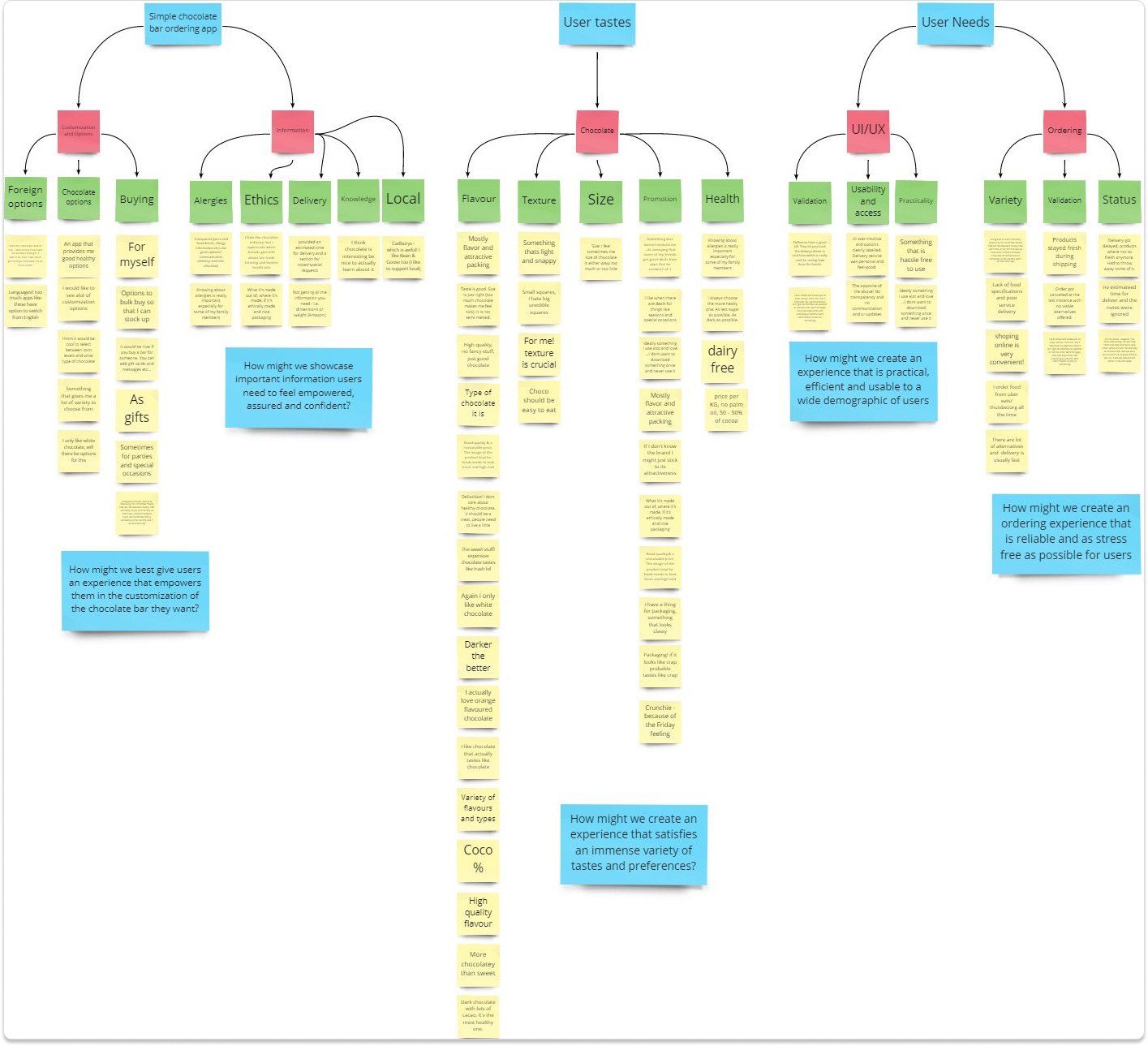
I then consolidated these findings into affinity diagrams, HMW statements, personas and feature ideations.
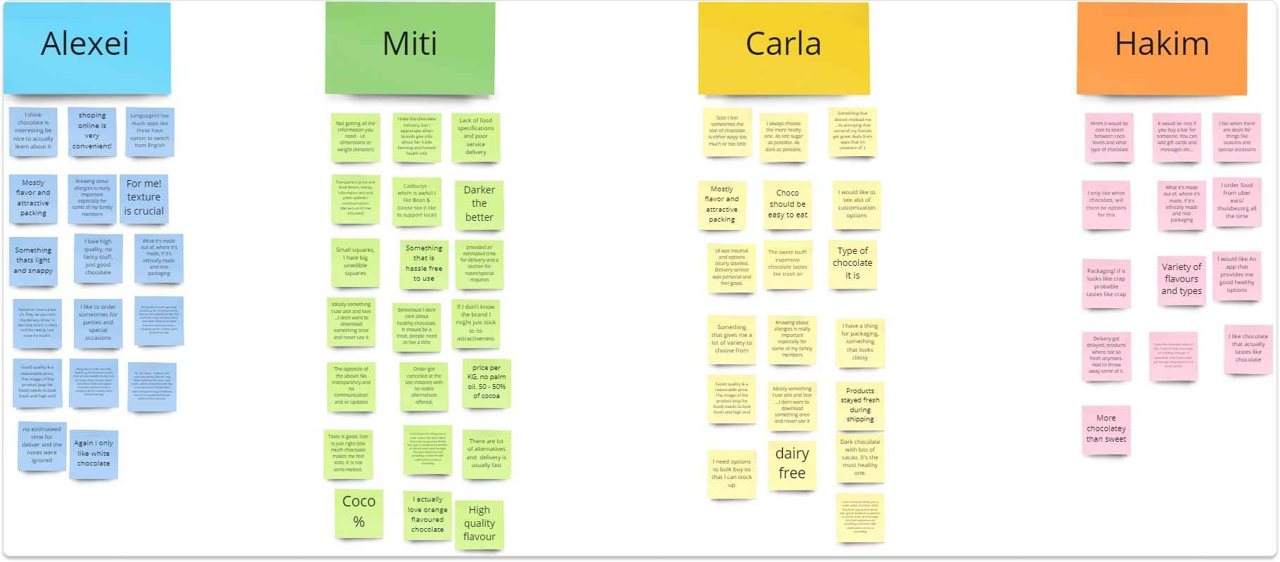
Interview key findings
Affinity Diagram
Feature Ideation Mapping
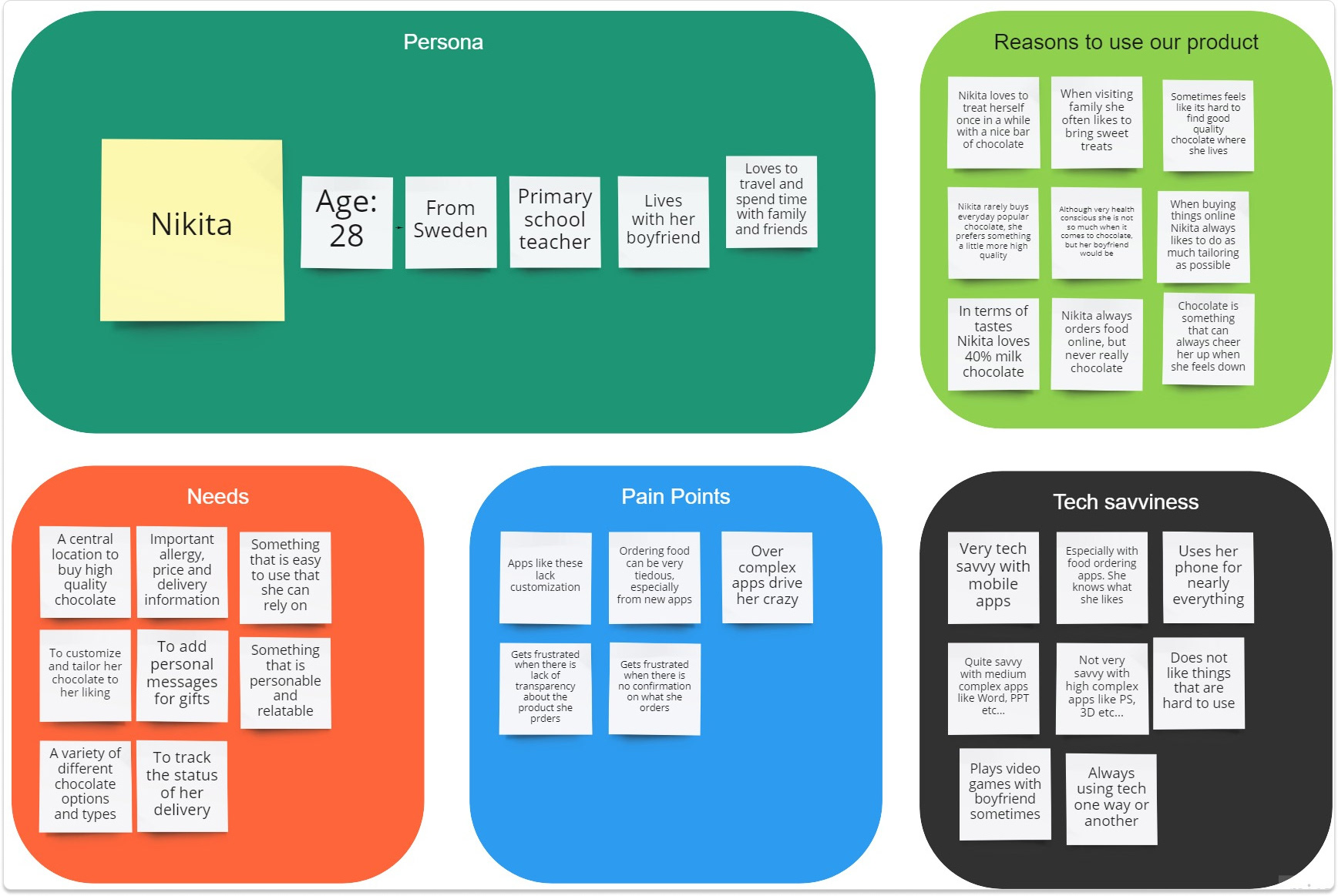
Persona
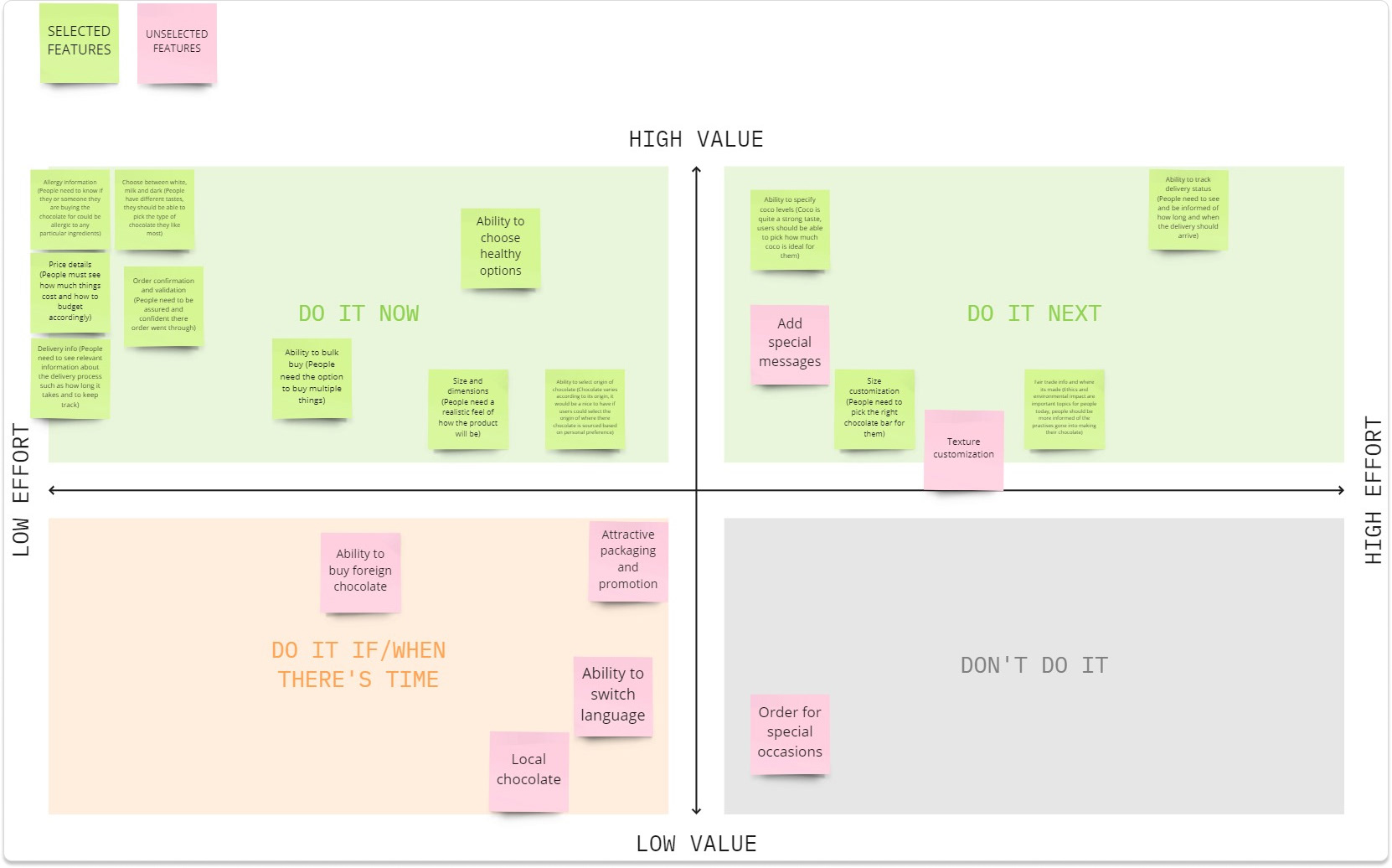
From my research and synthesization I identified a few key areas in which to include into the design of my app going forward.
Key finding #1 Customization
It was clear that people wanted an app that had a myriad of customization and ordering preferences. From a lot of food ordering apps people used, the ability to tailor your order was something that made the app very reliable and engaging to use.
“I would definitely use something that lets me customize the type of chocolate bar I want, similar to what you do when you order pizza or burger” – Alexei

Key finding #2: Information & Detail
People need explicit detail and information in order be confident and assured that what there buying holds up to their standards and is worth their hard earned cash.
“For me! I wont buy anything without knowing if I am allergic to it or not”
– Miti
– Miti

Key finding #3: UI/UX & Ordering
For food ordering apps it is essential that the UI is accessible, easy to use and reliable, hence why such apps like Uber Eats and Deliveroo are so popular the experience just works! Food ordering apps can overwhelm people with the amount of content at their disposal.
“Deliveroo have a great UX. They let you track the delivery driver in real time which is really cool for seeing how close the food it.” – Carla
“For an app like this I want it to be something I use a lot not just once”
– Miti
– Miti
“New apps scare me, I hope this will be not! It needs to be quick and easy to use” - Hakim
Following much of the valuable insights gathered I proceeded to create some low fidelity mock-ups as well as a site map.
Low Fidelity Mock-ups
Site Map
From preliminary sketches in Balsamiq I then moved into Figma to create an interactive low fidelity mockup from which to base all designs going forward as well as to test and validate with users.
Test: Validation, Usability, Feedback
Upon the creation of the low fidelity prototype, I then proceeded to test and validate with users in order to gather their feedback and insights on the design so far to see where I can improve the design going forward.
My first testing session was with a university student in which I set out series of tasks for her to complete along the flow of the process but also for her to think aloud and give feedback throughout the session.
It was quite an eye opening experience in the sense I was able to witness first hand how someone with no knowledge whatsoever of the app would be used for the first time, it shed light on many of the potential pitfalls I may have ignored or was ignorant to.
Overall Rosemary was very fond of the design and felt it was quick and easy to use however she felt as if the app could be very much improved by tightening up a few loose bits particularly around labelling and visual design.
As well as that she also mentioned the app at times felt very flat and linear without any engaging elements that make apps like this stand out and be fun to use. Following this discussion it gave me insights into particular areas of the design that could be augmented and some new ideas to try out and iterate further upon.
Remote Usability Testing with Lookback.com
After further iteration and tweaking of my design I then proceed to conduct another round of usability testing, this time with Lookback in which I recruited 5 users to complete 2 tasks during the chocolate bar creation process.
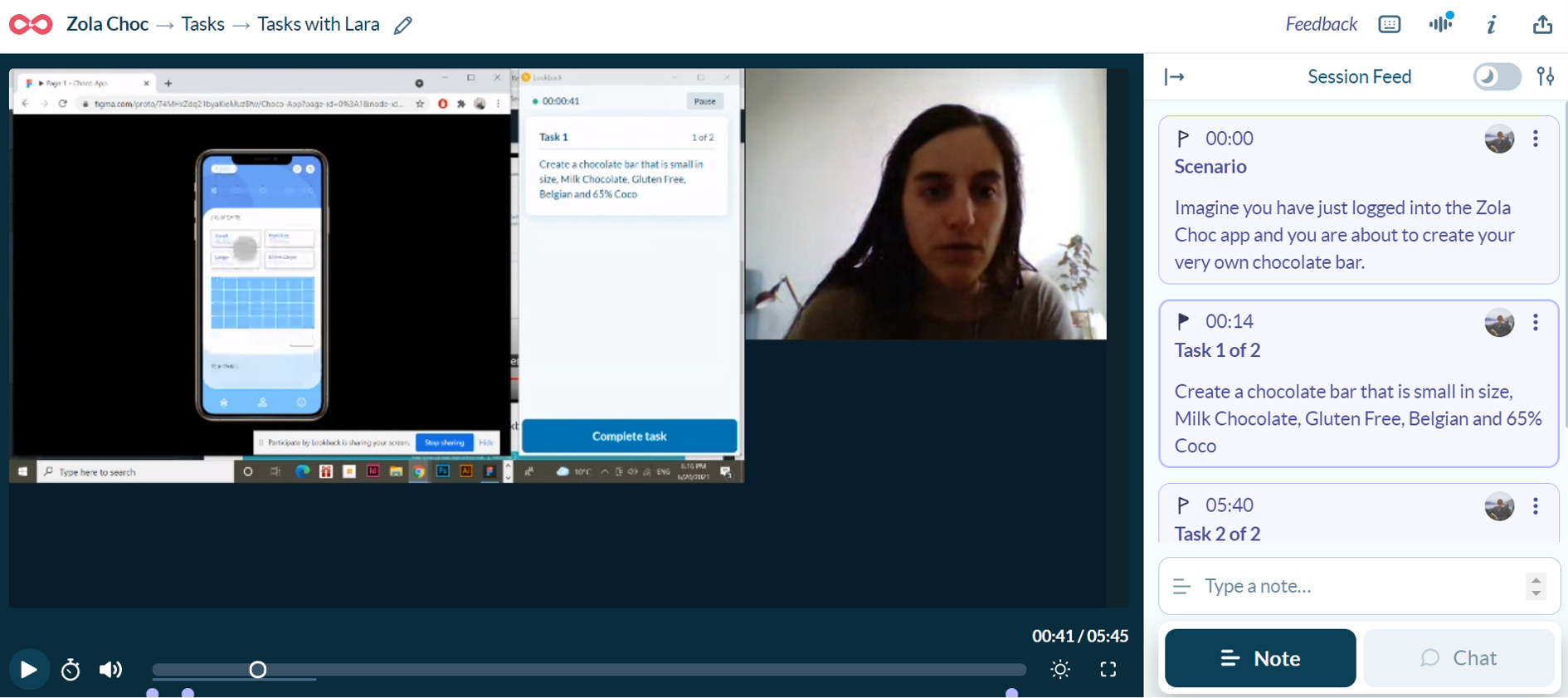
Overall All 5 participants were able to complete the entire session in under 6 minutes, with each of them giving praise to the apps aesthetic, functionality and plethora of customization options and information. Although this in many respects was a success there were a few pitfalls worth noting for which needed to be improved particularly around interactive elements as well prominent labelling.
Design Iterations
Following the insightful feedback and practical usage of my mock-up from users as well as further consideration for accessibility, I was able to consistently improve and iterate upon my design refining it at each stage.


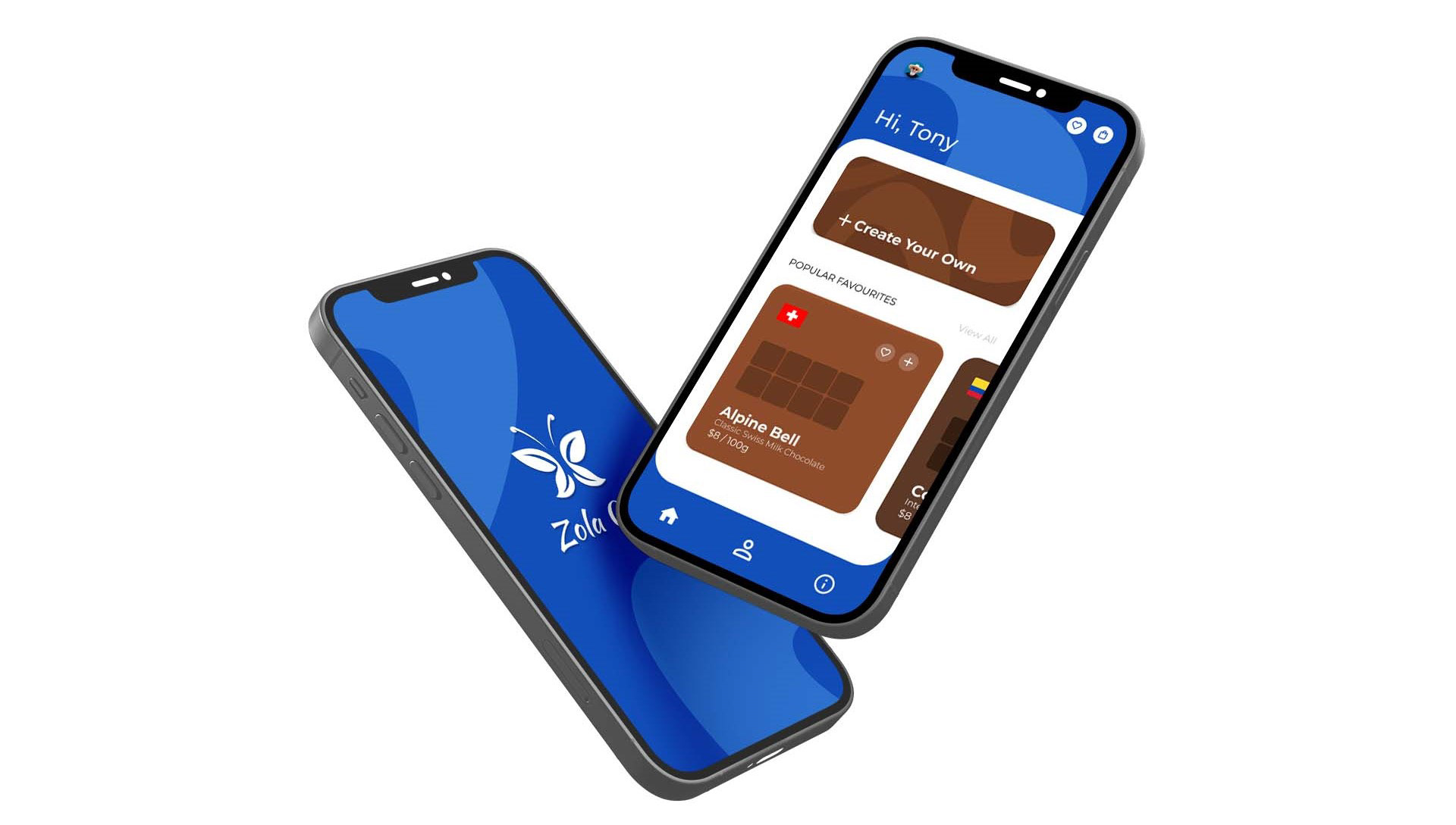
Final Design, Solution and Impact Overview
Following three months of research, design and testing I was able to successfully create a prototype for which is backed up with extensive user insights and solutions to common pain points experienced. Furthermore, I have been able to create a prototype that not only is practical and useful but also fun and engaging for people to use, which I feel is something that should go hand in hand with an app that is all about Chocolate and the joys and togetherness it brings to people.
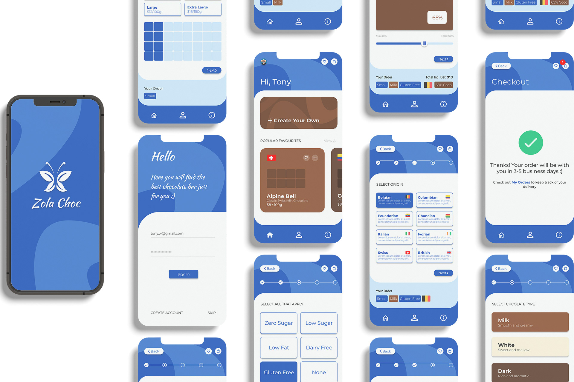
Click images to enlarge
Click images to enlarge
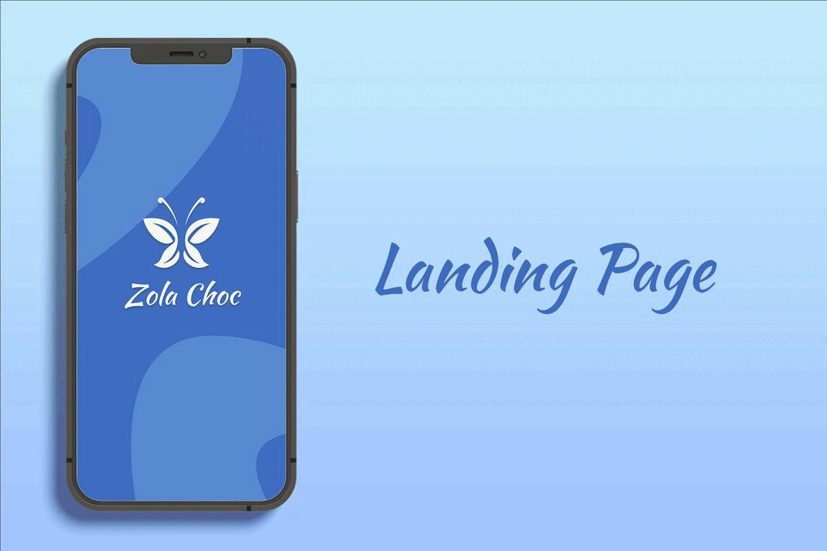
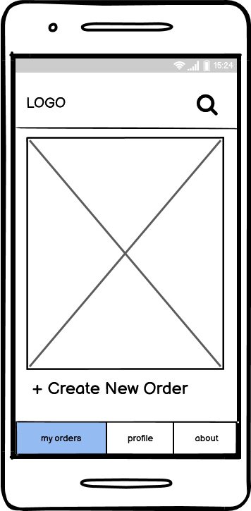
Landing Page
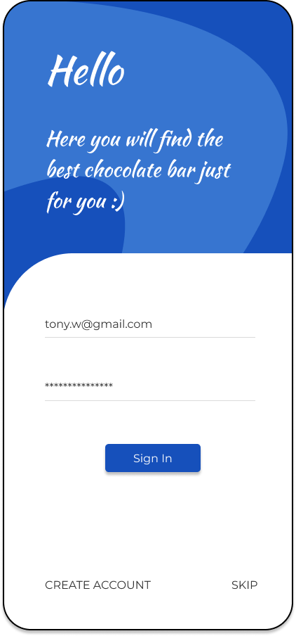
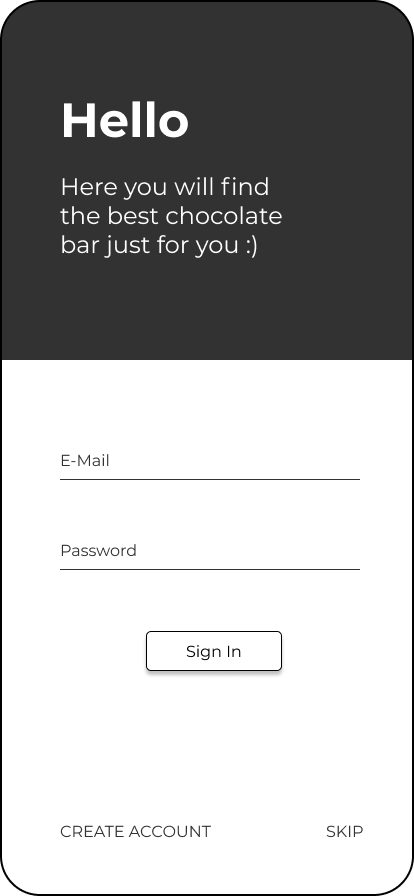
Sign In Page
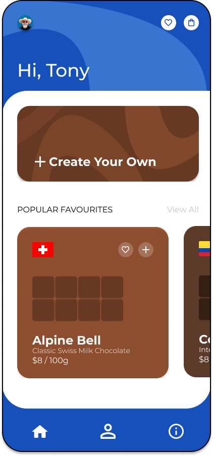
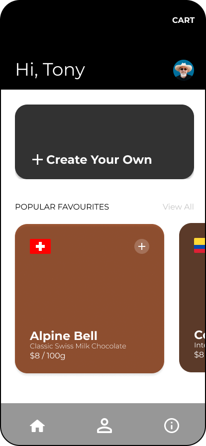
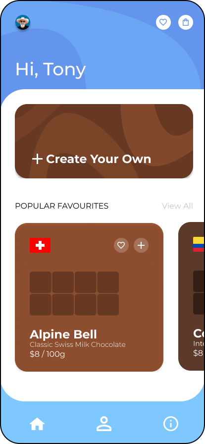
Homescreen
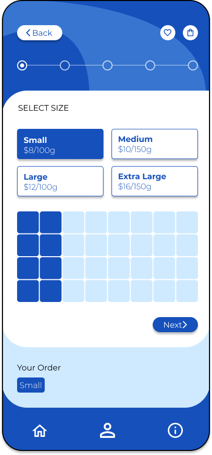
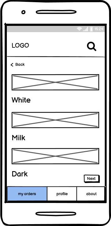
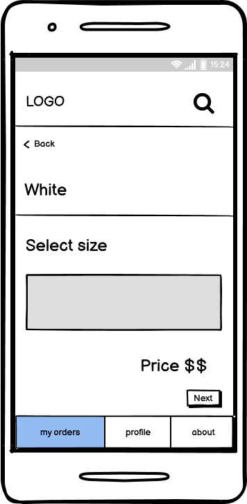
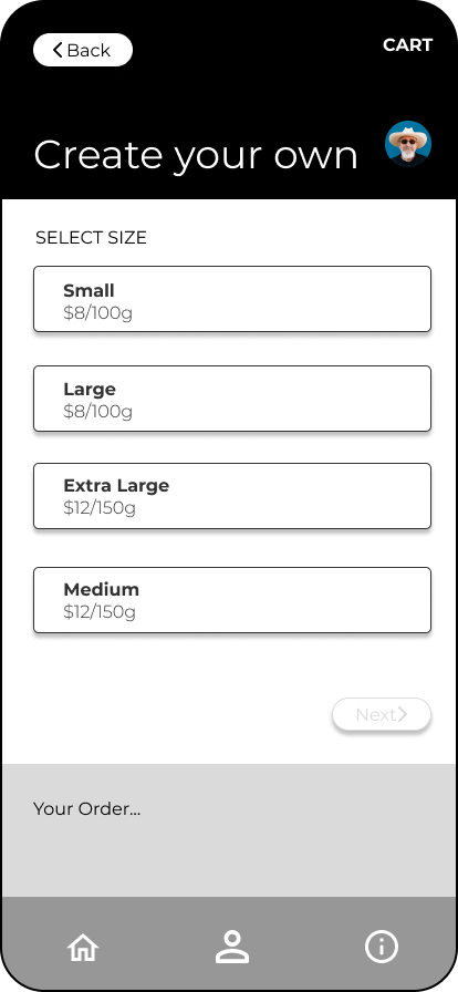
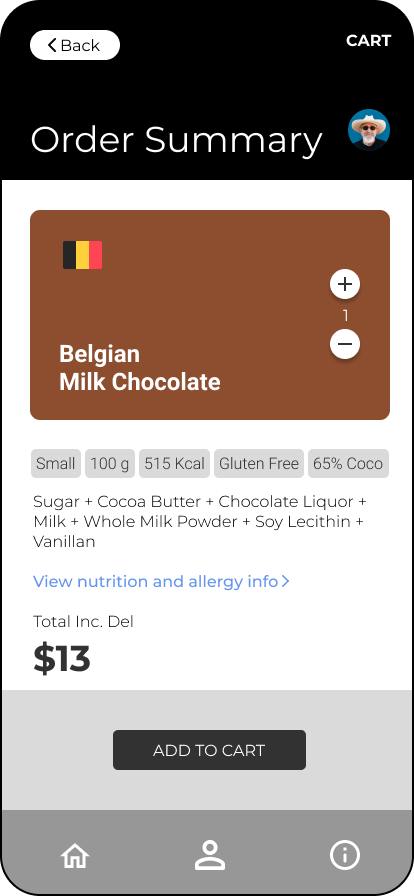
Select chocolate bar size
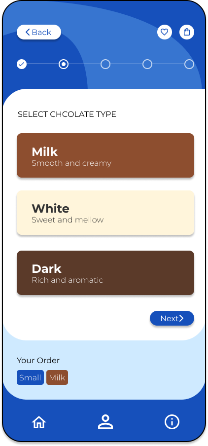
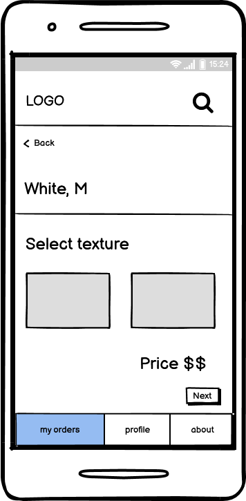
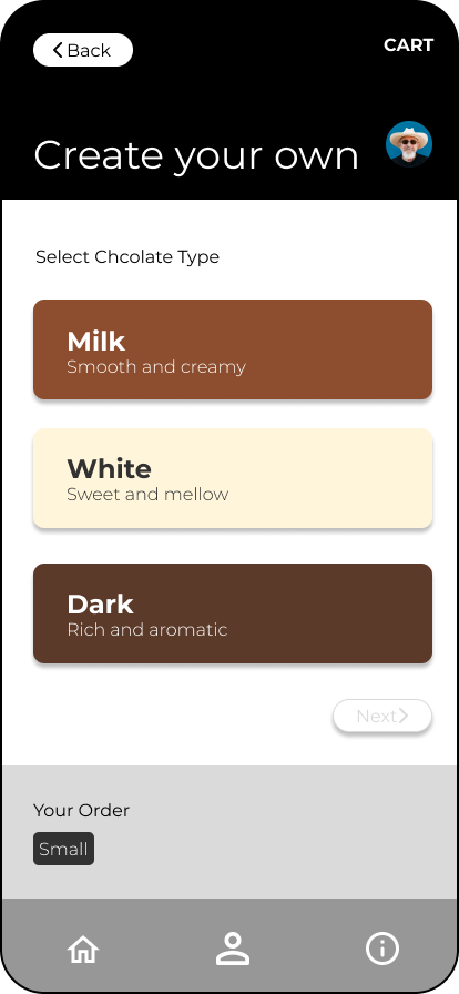
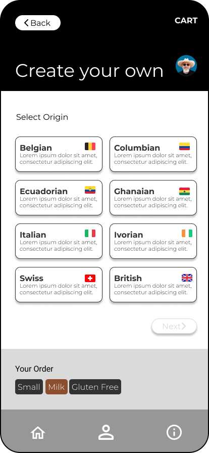
Select whether it be milk, dark or white chocolate
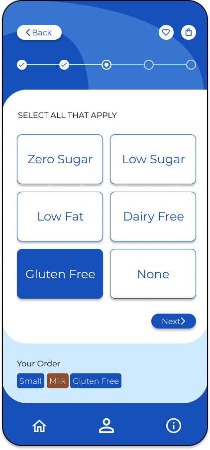
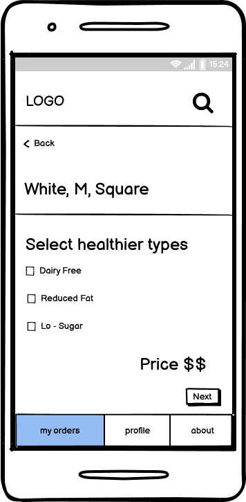
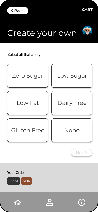
Select health options

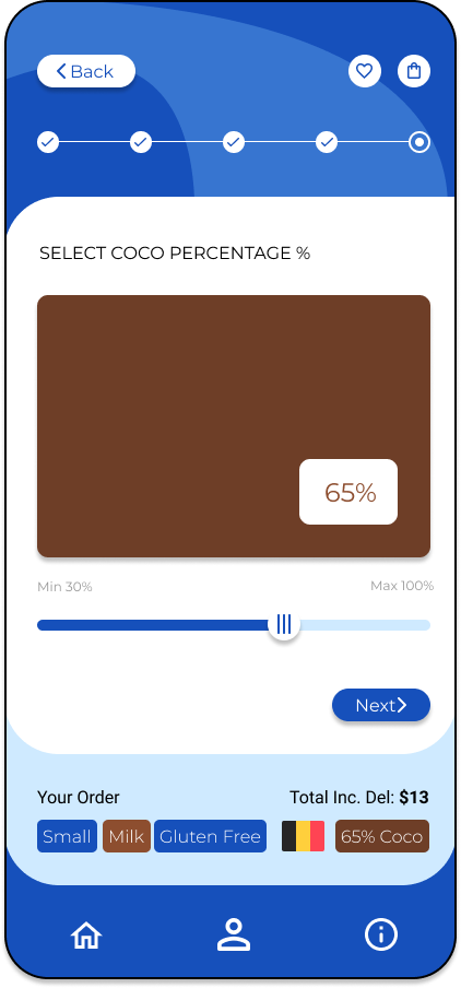
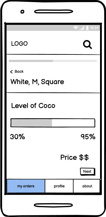
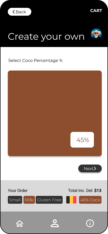
Select coco percentage

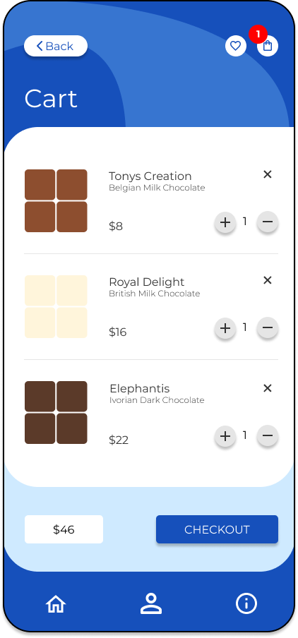
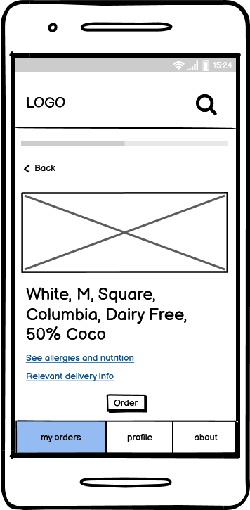
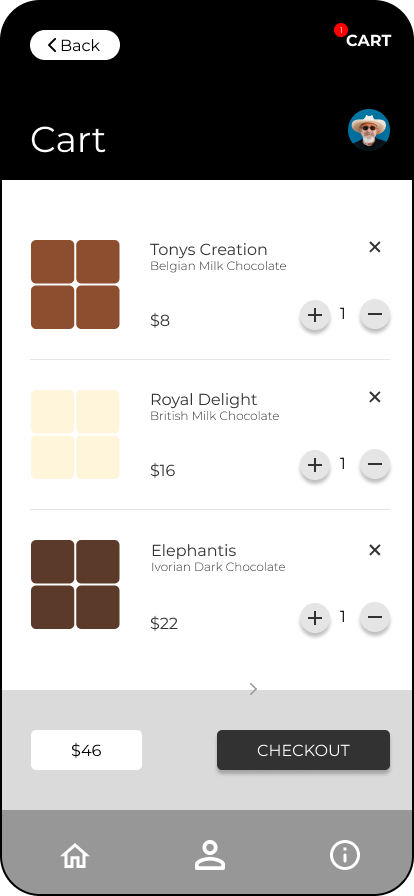
Cart summary page
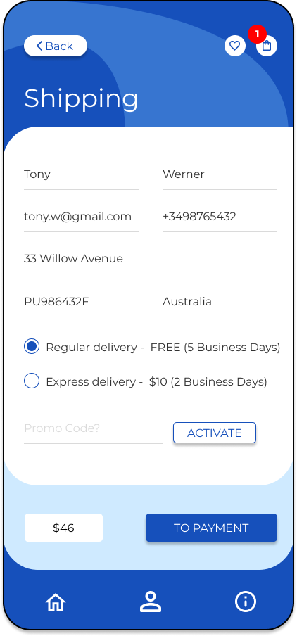
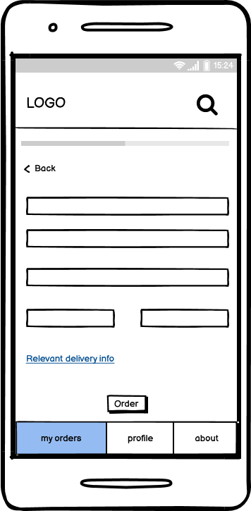
Enter shipping details
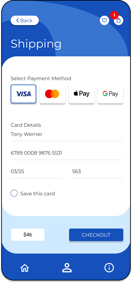
Select and enter payment details

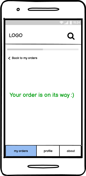
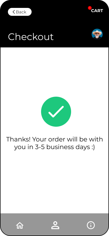
Order confirmation screen


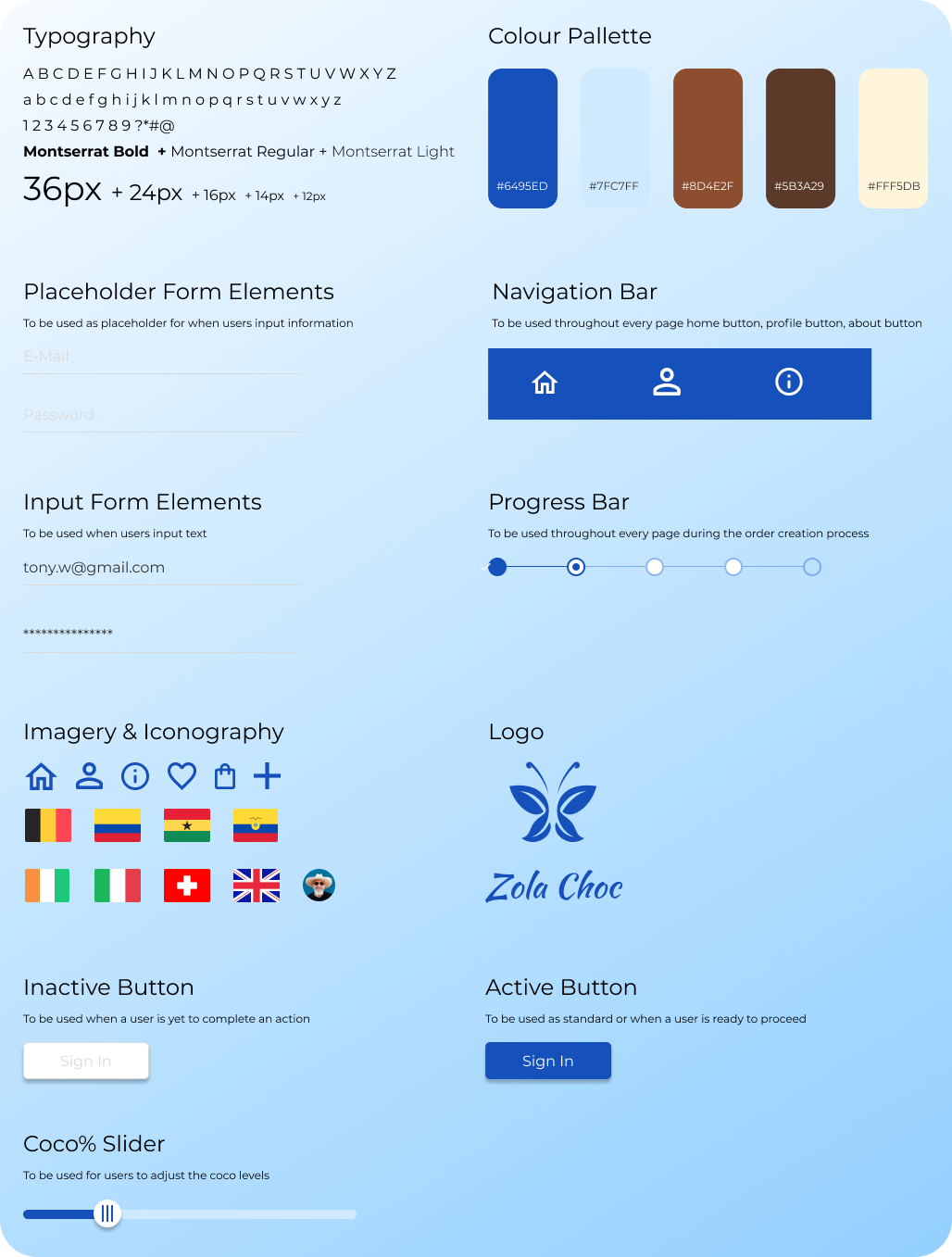
Design System
Shown below is design system I created for the visual identity of the app as well as a pattern library and guidelines for the creation of various UI elements and interactive components.