
Role:
• Co-lead product designer
• Ideation
• Prototyping
• Ideation
• Prototyping
Outcome:
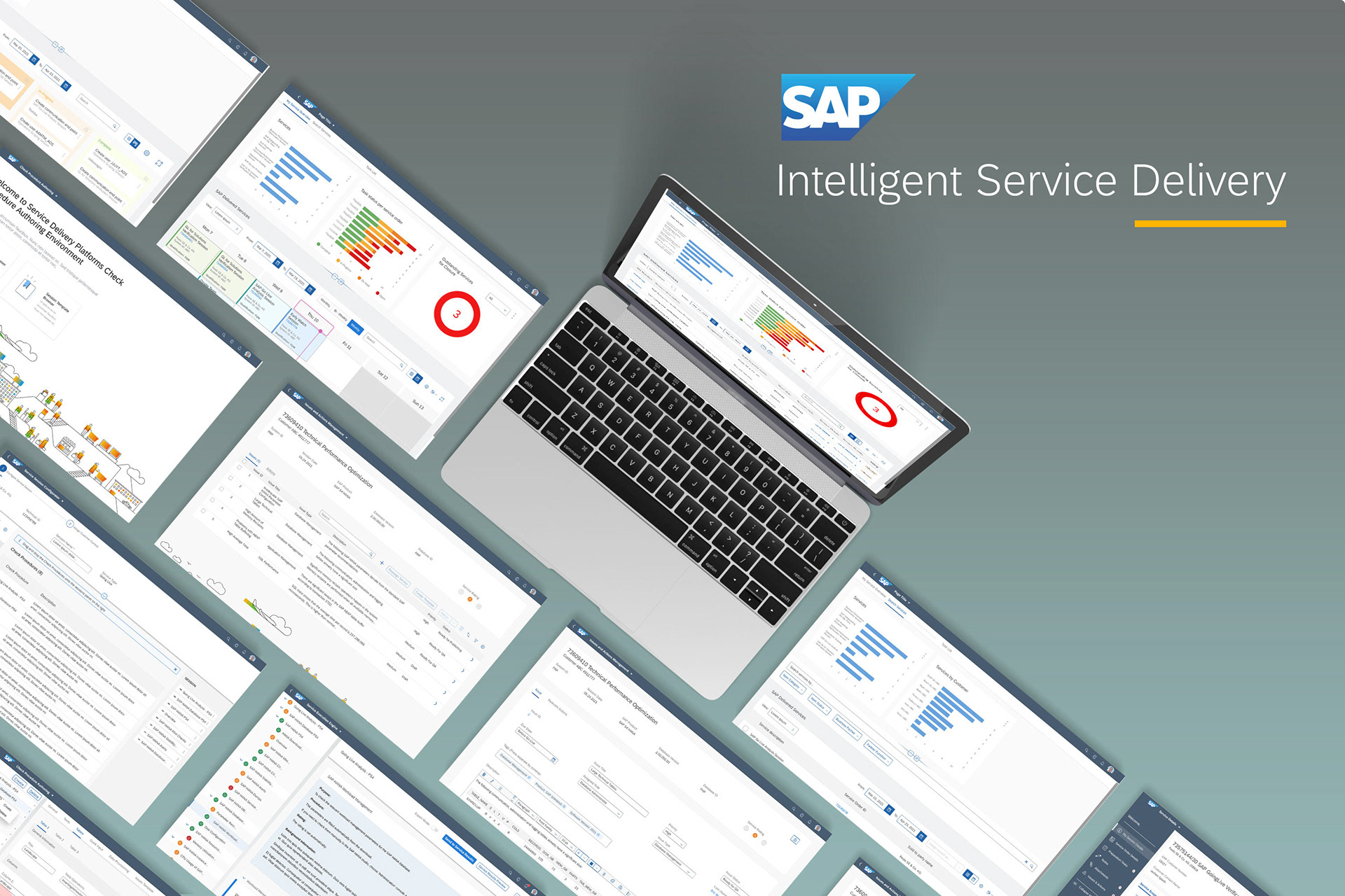
A comprehensive dashboard that gives users an insightful view into how McAfee has been protecting them overtime. Which in turn, gives McAfee the chance to show people its intrinsic value overtime also.
A consistent design that will easily allow for further features to be included.
Out with the old, in with the new:
So when we talk about the new Security Report, what it really is, is a revamped version of the old Security Report and Security History feature fused into one comprehensive UI.
Coming into the new McAfee desktop app landscape, it was proposed to combine these two features into one holistic UI as they both do pretty much the same thing just with different formats.
The old Security Report gave the user a high-level breakdown of how they were being protected, whereas Security History was pretty much a granular and more detailed breakdown.
This all called for an exploration of ideas to see how best to combine both features as well as create a new refreshed and useful design suitable for the new desktop app landscape going forward.

The journey:

Understanding and Findings

Brainstorming and ideation

Feedback sessions

Drafting of solutions

Comprehension user click test

Final design
The Team:
2 Product Designers
1 Content Designer
1 User Researcher
1 Product Manager

Understandings and findings
As with all projects starting off it was key for us to understand the ins and outs of the requirements with consistent discussions with our PM and various stakeholders.
Adding on to that, since we were combining Security Report and Security History into one holistic feature we conducted detailed audits of their respective flows and did heuristic evaluations of their UI’s to understand how they both tick and see where we can come in and improve upon the existing designs.
From all this we found that…
Although informative, both features are not the most engaging or intuitive to make use of.
Both features are out of sync with the latest design trends in McAfee, particularly Security History. As well as that, we found plenty of room for improvement and inclusion of useful features, information and metrics.
Brainstorming and Ideation
So following the understanding we had gained as well identifying key areas to improve upon, we got to work on brainstorming various designs and ideas for how the new Security Report could be.
Our first couple of ideas revolved around optimizing the current Security Report design by touching up the UI and of course integrating Security History, as this developed we wanted to created something more stripped back and simplified and change up the design to fit the modern design trends at McAfee, these two designs here on the right reflect this approach.
Our first couple of ideas revolved around optimizing the current Security Report design by touching up the UI and of course integrating Security History, as this developed we wanted to created something more stripped back and simplified and change up the design to fit the modern design trends at McAfee, these two designs here on the right reflect this approach.

Early wireframes and concepts

Dashboard inspirations
Feedback sessions
Having created a couple of designs at this point, we brought these forward to the wider CXD team to get their insights and feedback on what we currently had done, these sessions proved to be very insightful going forward, as the team gave feedback on the interactive aspects as well as how to make the metrics more engaging.
One key insight to come out of these sessions was to re-introduce the graphical component to the design, to help the user better visualize what McAfee had done for them over time.
Alongside these CXD sessions, we also had consistent content review sessions and stakeholder review sessions for further scoping and design critique.

By re-introducing the graphical component we could now give users a dynamic visual representation of how McAfee was protecting over time but moreover a means for them to keep track of their protection over time.
Drafting of solutions
This all led us to a place in which a consistent design was beginning to emerge, following further ideation we now had a design we were beginning to feel confident we could showcase and test with users.
Going forward, nothing major changed from here on out, this design included a topside navigation bar to tab between features, high level key metrics at the top of the page, a seamless switch between Security Report and History and an interactive graph component.
Going forward, nothing major changed from here on out, this design included a topside navigation bar to tab between features, high level key metrics at the top of the page, a seamless switch between Security Report and History and an interactive graph component.

Design progression
Comprehensive click test
With a more confident design, we then proceeded to test it out via a comprehensive click test along with our UX Researcher.
We recruited 100 users. For the test itself the users were given a set of 6 first click tasks to test the discoverability of various elements on the Security Report Page. Below on the left was the design that was tested.
We recruited 100 users. For the test itself the users were given a set of 6 first click tasks to test the discoverability of various elements on the Security Report Page. Below on the left was the design that was tested.

First round click test success rates and heat map example
Comprehensive click test 2
For the most part users were successfully able to complete the tasks provided to them from the first click test, however there was some minor confusion around particular UI elements and what exactly they did. For example…
- The threat metric section at the top, many users thought this was clickable, which it wasn't.
- The “Security History” switch was not prominent enough.
- The interactive elements for the graph were not very consistent.
From that, a second click test was conducted to gain further insight on some of the confusion and to iron out the inconsistencies.
Following these insights we worked on creating an improved design tackling much of the shortcomings found from this session.

Second click test results showing improved results
Final design
So following our tweaks and one more round of a click test, we eventually came to a conclusive design that incorporates many insights uncovered and goals set out for what we wanted the new Security Report to be.


Finalized design accompanied by end to end Security Report user flows
To summarize the new Security Report has…

Less cluttered UI, focus on the metrics and info.

Interactive elements more prominent.

Finalized data points and content.

A seamless and dynamic design that allows for further feature inclusion.

Localization compliant, so it’s fully compatible with other languages.

As of June 2023, The new Security Report was released.
Interactive prototype
Going forward
Lastly then, I would like to talk about what's next for the Security Report going forward…
Since the Security Report is now released going forward there will be ample opportunity to easily integrate much more McAfee features such as Tracker Remover, Shredder, Personal Data Cleanup, Dark Web Monitoring just to name a few. this is possible due to the template style design we created.
Below are a few examples of how other features would look when integrated into the new Security Report.

Security Report showing Tracker Remover, File Shredder and Web Protection
Final thoughts
Starting out our task was to simply merge the old Security Report and Security History features into some sort of vague dashboard. However, with that said our goal as designers was to create something special, refreshing and useful to be launched into the new desktop landscape. After the many weeks of ideation, testing and finalizing our designs I can confidently say we created something far better and useful than was originally set out by the brief. Our new Security Report is highly informative but at the same time not overwhelming, it drives consistency and acts like future proof template for expansion it also has a refreshing look and feel, something for which we strived for for all new desktop features.
With all that said, I think there is plenty room for improvement and things we could have done differently. First off, I think it would have been worthwhile exploring how the Security Report could have been featured on the homepage to give users an upfront glance at their protection as opposed to an imbedded feature. To add to that, it could have been interesting to also explore how things like gamification could have added or detracted from the experience. I would also say that perhaps additional functionality like filtering, sorting and further graph configurations and styles could have added more to the experience.